The Prime Wave is a free weekly publication intended for active traders and those interested to learn more about trading. If this has been forwarded to you, you can subscribe here to continue receiving the newsletter.
THE BIG IDEA
There are numerous seasonal factors that are believed to exist in the stock market. Some of them are probably real.
You have already heard about the Santa Claus Rally and the Wall Street wisdom to “sell in May and go away”. There are other less noticed regions on the calendar that tend to be especially weak or strong for sometimes unknown reasons.
A couple days ago we came across this chart from Ryan Detrick, CMT, who is the Chief Market Strategist at Carson Group.

The chart is a composite of the last 75 years’ worth of Novembers. The point of it is, of course, that there is a weak spot around the 19th-20th of the month, the period that we just passed through. So that goes some way in explaining the ugly trading we have seen in recent days.
Or does it?
It is doubtful that you are going to send a telegram to your broker instructing him (it is surely a ‘him’) to sell your shares of General Motors. Stock market behavior has changed since the 1950s. Maybe that dip we see on that chart was really there decades ago but is gone now.
Or the opposite could be true. Maybe a strong seasonal dip that has developed in the 21st century is being diluted by older data where there was no seasonal effect.
We decided to find out.
To us, the modern era of the stock market began after the Great Financial Crisis. So we re-created Detrick’s chart but just using S&P 500 data starting in 2010.

That dip that occurred on November 19-20 does not exist anymore.
What does exist is the same general shape as on Detrick’s chart - a vigorous start to the month, followed by a flat period in the middle, and then a bullish end.
And that strange divot on the November 9ths? A 3% drop in 2011 and a 2% decline in 2022 account for most of it. I would not call it a trend.
Most interesting of all is simply that recent Novembers are up 4.66% on average. The market has some work to do to even get close to that result this year.
If you liked this post, please make sure to fax it to your friends and acquaintances!
SEEN ON THE INTERNETS
This newsletter is focused on the stock market over a 3 day to 3 week timeframe. That doesn’t mean there is no value in looking at monthly charts.
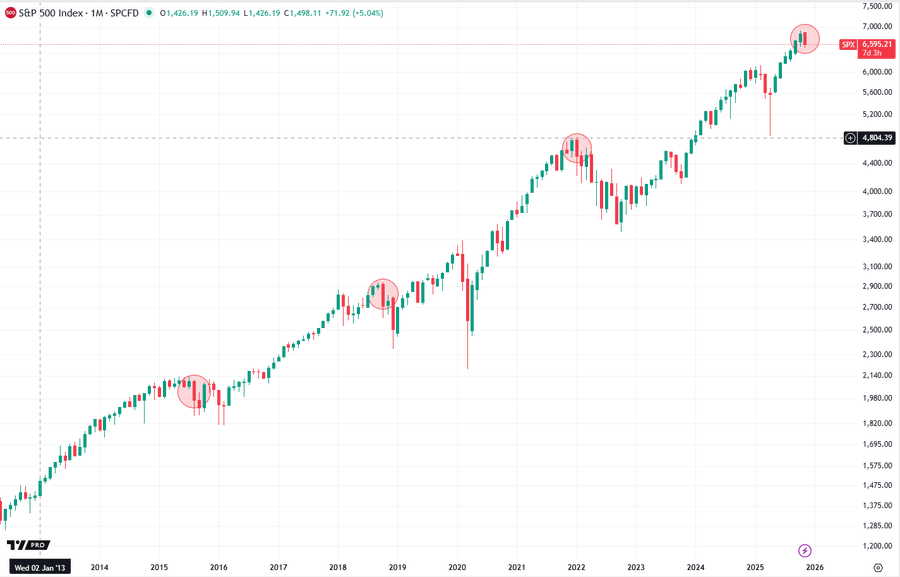
David Cox, CMT, CFA posted this chart of monthly candlesticks going back to 2012. The chart highlights a candlestick formation known as a bearish engulfing pattern.
This can happen in an uptrend when there is a green candle followed by a red candle. The body of the red candle must be both higher and lower than the previous candle, thus it “engulfs” that candle.
In practical terms, it means the current period started out bullish but a shift in the market has wiped out all of the previous gains, plus more.

Maybe this is all a bunch of mumbo-jumbo. But stop and look at those previous three instances on the chart. The market went further down every time.
The good news is November is not over yet and there is still time for the market to change its mind. An engulfing candle can be avoided with an end-of-month close above 6665, about 1% higher from here.
NUMBERS ONLY
$372 billion | From the opening bell on Thursday until the market closed at 4PM NY time, NVDA shareholders lost $372 billion of wealth. |
447 | On Friday, 447 of the stocks in the S&P 500 went up. This is the highest daily number in six months. |
7.14% | Despite a handful of bleak days, the S&P 500 is still 7.14% above its 200-day average. It could fall further from here and still considered to be in a long-term uptrend. |
SWINGEX INDEX
As of market close on: 21 November 2025


Swingy says: A scent of fear is wafting through the jungle. You can attack, but stay alert!
See some historical examples of the Swingex Index in action here.
WATCHER
Stocks highlighted here each week are not recommendations to buy or sell. They are provided as ideas for swing traders to follow up on with their own research.
In the current situation, there are two types of charts that look interesting: those that have completely blown up and are due for some reversion to the mean, and those that are demonstrating good relative strength.
This week we will show you one of each type.

HOG (Harley Davidson): Harleys are on sale! At least the stock is.
After making a recent peak in early September, it has been nearly straight downhill for HOG. The shares lost a quarter of their value since then.
Two signs of life appeared on Friday. We like that the stock closed above its high price from the market’s brief moment of euphoria Thursday morning, and that it did so on robust volume.
The first Fibonacci retracement level is around $25.50, which is also the high end of that congested area from early November.

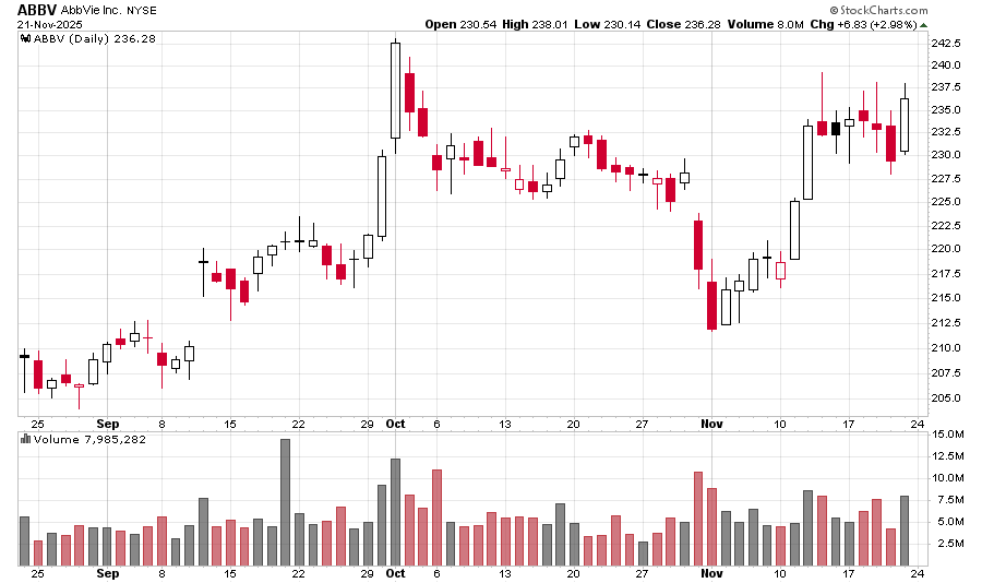
ABBV (AbbVie): While much of Wall Street burns, ABBV is currently sitting at its second-highest closing price ever.
The stock has formed a flat, if volatile, base during the last seven days while the S&P 500 has been roughed up. The market keeps probing prices above $236 only to retreat. It is possible that in even a neutral market ABBV would be heading higher.
If market sentiment cooperates, the stock could challenge or even exceed its all-time high in the near future.

